
Spectrum Displays
Overview
- Spectrum Graph
- Waterfall Display (classic spectrogram)
- Multi-strip spectrogram (usable as "Morse Tape Reader", etc)
- Visual AGC (for the spectrogram colour palette
- Amplitude Bar
- Reassigned Spectrogram
- 3D Spectrum Display
- Correlogram
- Displaying Icom's broadband spectrum instead of SL's FFT output
- Main Frequency Scale
- Multi-channel operation of the spectrum analyser
- Spectrum averaging (overview)
- The "second spectrogram"
See also: Spectrum Lab's main index, 'A to Z', display settings, Controls on the left side and on the bottom of the main window (separate documents).
Spectrum Graph
This graph shows the spectrum as a line plot. One axis of this graph is the frequency domain (with an optional display offset), the other is the amplitude (linear or logarithmic, depending on the current FFT output type).
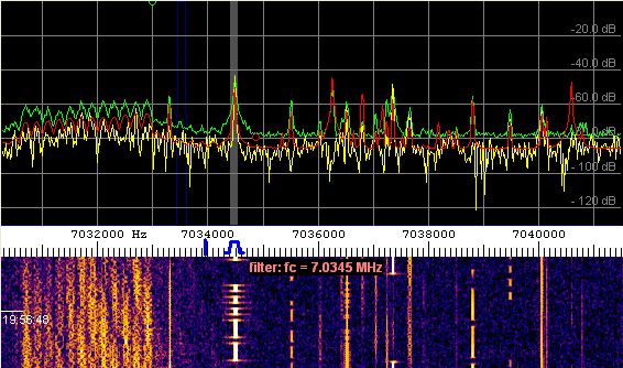
(spectrum graph, frequency scale with filter passband controls, and spectrogram display)
With logarithmic FFT output, the amplitude scale is in decibels (about 90 decibels maximum). The 0-dB-point can be set anywhere from the display configuration dialog (or by command).
The relation between input voltage into the A/D-converter and the FFT output value in decibel (dB) is explained here (use your browser's "back" button to return..)
The displayed amplitude range can be modified in the
setup dialog.
As an overlay for the spectrum graph, a reference
curve can be displayed, a
peak-holding curve (which shows
the largest peaks from the previous XX seconds; green in the screenshot above),
and an average spectrum
curve (which shows the average over a selectable part of the
spectrogram; red in the screenshot above).
The display colours -also the "pens" used for various curves- can also be
modified in the setup dialog.
You may right-click into the spectrum graph to open a popup-menu which allows you to:
- turn an amplitude- and frequency grid on and off
- rotate the spectrum (along with the waterfall) by 90 degress.
- switch between "split window" and "full-size plot" (no waterfall)
- select between the normal graph mode and a special coloured-bargraph, where each bar is painted in the same colour as the waterfall (amplitude-dependent).
- turn the "peak holding graph" on and off (in the submenu "Spectrum Graph Options")
- turn the "momentary" (non-averaged) graph on and off (in the same submenu)
- turn the "long term average spectrum" on and off (details in the chapter about averaging)
- ... and a few other settings for the spectrum graph
The update-rate of this display (as well as the waterfall) depends on the waterfall scroll rate.
The frequency resolution depends on the sampling rate, decimation, FFT size,
and FFT window function.
The displayed frequency range may be modified with the Time Axis panel or by pulling the (yellow or orange) frequency scale with the mouse. Hold the left button pressed and move the mouse left/right (or up/down) while the mouse cursor is over the yellow frequency axis.
There may be some programmable markers visible on the frequency scale, some of them can be moved with the mouse while others are just 'indicators' (for example: the frequency of the LO ("VFO") can be tied to one of these markers).
Small green and green circles in the graph area indicate the
data-readout-cursor in peak-detecting mode, small
red and green crosses are the readout-cursors in normal (non-peak-detecting)
mode.
See also:
-
FFT Averaging : Different kinds
of spectral averaging help to reduce noise when looking for weak but
coherent signals. Averaging operates on a sequence of FFTs.
-
FFT Smoothing : Further reduction
of "visible" noise when looking for weak and incoherent signals.
Smoothing operates on neighbouring frequency bins, and causes some "blurring"
along the frequency axis.
Waterfall Display (aka Spectrogram)
This scrolling bitmap usually shows the "history" of the last recorded spectra. As time proceeds, old samples will be scrolled out of view; but they can be scrolled back with the time slider on the "Time" panel (in the upper left corner of the main window).

(stereo spectrogram with amplitude bar and log frequency scale)
The intensity (amplitude) of a particular frequency affects the color of a pixel in this bitmap. The relation between amplitude and color can be controlled by a contrast- and brightness control panel on the left side of the main window. Additionally, you can turn on the "visual AGC" function to let the program adjust the brightness value automatically, when the noise level (in the displayed frequency range) changes.
In it's original form (with the "water" falling down), the X-coordinate of a pixel is derived from the frequency-axis, and the Y-coordinate is the time axis (depending on the "scrolling speed" which is adjustable under the display settings).
The visible frequency range can be modified by pulling the frequency scale with the mouse (hold left mouse button down with the mouse pointer over the frequency scale).
The displayable frequency range and -resolution depends on the
FFT settings (size, decimation, center
frequency) and the audio sample rate.
For example, an FFT with 40 uHz resolution requires about 1 / 40 uHz = 2500 seconds, or about 7 hours,
to collect the equivalent number of samples.
If the waterfall runs in RDF mode (radio direction finder), the colour of
the waterfall shows the angle of arrival, while the brightness shows the
signal strength. More on that in this separate
document.
By default, the waterfall is automatically redrawn after modifying any setting
that affects it (e.g. contrast, brightness, displayed frequency range).
If this causes issues with CPU load, this feature can be turned off via
display settings
("don't redraw waterfall after modifying settings").
Multi-strip spectrogram
For long-term observations of "narrow bands", the spectrogram screen can optionally be split into multiple "strips", which will be vertically or horizontally stacked (depending on the orientation of the frequency scale: if it runs vertically, small spectrogram strips will be stacked vertically, with the newest strip on the top and the oldest on the bottom). The height of the strip is configured in the display settings. The number of strips is only limited by the screen size. Notes:- The multi-strip waterfall will not be redrawn completely if contrast or brightness are modified.
- For very special applications, a new strip can be started anytime (even if the previous line has not reached the maximum with), using the command water.new_strip . This can be used, for example, to synchronize the multi-strip display to full UTC hours (follow the link for an example).
- For other special applications, with the Conditional Actions / event: "new_strip",
you can let SL do 'whatever you like' whenever the display reaches the end of one strip and begins the next.
For example, when beginning a new strip in the waterfall display, you could execute a program turn the antenna to another direction, switch a (remotely controllable) receiver to a new frequency for the next "strip" of the waterfall, etc. The 'Multi-frequency Bat Monitor' uses that feature to synchronize the VFO frequency of a remote receiver with the strips of the waterfall display.
Like in many other components of the program, you can activate a context-specific popup menu by right-clicking into the display. Some options for the waterfall are:
- Frequency grid overlay
- Waterfall Time Grid : Allows time markers as a grid overlay (over the spectrogram), and/or text labels in various formats - read more.
- Rotation of the display by 90 degrees (=vertical or horizontal frequency scale)
- etc ...
If the main window shows a combination of the Spectrum Graph and the waterfall, both are separated by the scrollable frequency scale (which applies to both).
Notes:
- Click into the waterfall with the left mouse button to show the spectrum graph for that line of the spectrogram for about two seconds. It will look like the spectrum graph is frozen for a short time, but this is done deliberately. To freeze the waterfall display for an unlimited time, use the Start/Stop menu (stop "Spectrum Analyzer #1", which is the one in the main window).
- Click into the waterfall with the left mouse button, and hold the button pressed while moving the mouse to mark a rectangular area. When releasing the button, a special popup menu appears. In that popup, you can select special functions like the spectrum replay function.
- Click into the waterfall with the right mouse button to open a popup menu, which gives quick access to some important parameters without having to open the display control panel.
- The waterfall colour palette can be selected by clicking into it. You can also define your own colour palette as described here.
-
Every calculated FFT spectrum will be drawn in the waterfall as a colored
graphic line which is one or two pixels high (or wide, depending
on the orientation). So, if the "scroll rate" is set to 200 milliseconds,
the waterfall will move down (or left) by 10 graphic pixels per second..
but:
If the CPU cannot keep up with the waterfall speed, the waterfall will scroll slower than you defined in the display settings ! That's not a bug, it's a feature ;-)
The program can periodically save the contents of the waterfall. See periodic and scheduled actions. Experienced users can control the waterfall display via interpreter commands (even from other applications).
Visual AGC (for the spectrogram colour palette)
Normally, the colour palette of the spectrogram is only controlled through the contrast- and brightness slider on the left side of the main window. But optionally, you can turn on the "visible AGC" on the second tab of the Spectrum Display settings.
Technically, the term AGC = automatic gain control is a bit misleading. In fact, the "visual AGC" works as follows:
When painting a new line into the waterfall, the program first measures the noise level within the displayed frequency range, as explained here. Then, it subtracts this value (actual noise level in dB) from the reference value, which can be set in the display settings window (typically -100 dB). Next, this difference (deviation) is passed through a simple low pass filter, depending on the visual AGC speed (slow/normal/fast). When painting the waterfall, the low-pass filtered deviation is added to all FFT bins, before converting them into a colour values.
The "visual AGC" avoids that the spectrogram image will not get too dark or too bright if the input signal level changes. This happens, for example, if the spectrogram shows a shortwave radio signal, and the path loss changes dramatically, or (for some reason) the local noise level rises.
One of the downsides of the visual AGC is, you cannot tell the signal strength
(voltage, power, or whatever) from the colour in the spectrogram display.
You may be fooled by the AGC, when a narrow-band signal "disappears", which
in fact is just overwhelmed by broadband noise. Without the AGC, you would
have seen that the noise went up. So be sure to turn on this AGC only
if you really need to.
- Note:
- As a reminder that the visual AGC is enabled, the brightness slider is labelled "b" (lower case) when the AGC is on. To turn it off, click on the "b" to change it back to "B" ("B"=AGC turned off, brighness only controlled through the brightness slider).
Amplitude Bar (alongside the spectrogram display)
An optional amplitude bar can be displayed on the side of the waterfall. It can show the "peak" value of the input signal in the time domain. Unlike the waterfall display, the amplitude bar is not limited to a certain frequency range. It often looks like a seismogram (and in fact, has been used as such already):
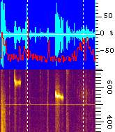
The background of the amplitude bar is blue. The amplitude from the first
input channel adds green colour, the amplitude from the second channel adds
red colour (if the analyser is configured for dual channel mode, of course).
So if the bars from both channels overlap, the result is white.
watch
window" (where they can also be plotted in a separate window). To define
which of the watch-window's data channnels shall be plotted into the amplitude
bar, open the display configuration
screen.
The amplitude bar can be configured (width in pixels, on/off) in SL's
"Configuration and Display Control".
At the time of this writing, it was on the tabsheet titled "Spectrum (2)".
With a vertical frequency axis, the amplitude bar is located above
the waterfall area. With a horizontal frequency axis, the amplitude bar
is on the right side of the waterfall area. In any case, that's near the
'high-frequency' end of the spectrum scale.
Reassigned Spectrogram
Under certain conditions, reassigned spectrograms provide more resolution along the frequcency- and the time-axis than the classic spectrogram shown above. For comparison, a zoomed conventional spectrogram (1st) and a time/frequency reassigned spectrogram (2nd) with the same FFT parameters :
More about reassigned spectrograms in a separate document; a few configurations with reassigned spectrograms can be recalled from the Quick Settings menu.
3D Spectrum Display
The 3D spectrum adds another dimension (the time) to the display, but is
often less easy to read than the waterfall display.

To switch the main display window to "3D Spectrum", open the spectrum display dialog (from the main menu: "Options".."Display Settings"), then select "3D Spectrum" in the combo list labelled "Show".
It is important to select a "strong" colour palette, with as many colour transitions as possible, and to adjust the displayed amplitude range carefully. Without a suitable colour palette, you will hardly see anything on the 3D spectrum. The colour palette is controlled the same way as for the spectrogram.
Furthermore, it helps to turn on the option "Amplitude Grid" in the display settings for a better readability of the amplitudes. But still, in the authors opinion, a 3D spectrum display is not particularly suited to read the amplitudes accurately. But it can help to see the amplitudes (y axis) versus frequency (x axis) and time (z axis, here: pointing from the foreground into the background).
Special options (which only apply to the 3D spectrum) are on an extra tab in the configuration window. Besides that, the following options also affect the 3D spectrum display:
- the background colour: defined on the "Display Colours" panel, labelled "Spectrum Graph Background"
- the colour used for drawing the scales around the graph: on the same panel, labelled "Spectrum Graph Grid"
- the option "Mirror for Lower Side Band" (on the 2nd tab of the display settings), which reverses the frequency scale
- the "Displayed Amplitude Range" (usually in dB), can be modified in the configuration window too
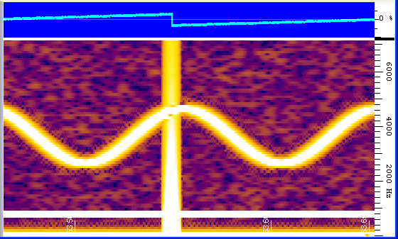
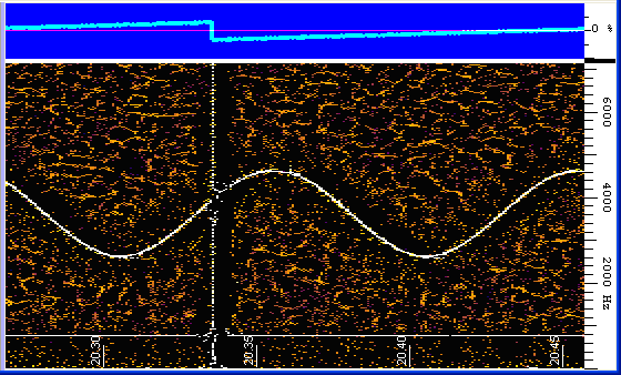
Correlogram
The correlogram is a rarely used function. It is a special graphic representation of the 'similarity' of two signals, or the 'randomness' in a signal.
More specific, it can be used as a cross-correlation plot (if the two inputs of the analyser are connected to different signal sources), or an auto-correlation plot (if both inputs are connected to the same source. The correlator itself doesn't care about that).
The graphic shows a plot of the correlations r(h) versus h (the time lags). In Spectrum Lab, the correlogram uses the same fourier-transformed sample blocks as for the "normal" spectrogram. In fact, the correlogram runs side-by-side with the main spectrum display (spectrum graph and/or spectrogram, as explained in an earlier chapter).
For that reason, the range of time lags delivered by the correlator depends on the FFT size of the main spectrum display.
Example: A soundcard delivering 11025 samples/second, feeding a 65536 point FFT, will fill a buffer with 65536 points (in the time domain) in 5.94 seconds. The maximum displayable time lag range will be +/- 2.97 seconds then, with lag zero in the middle. The following screenshot shows the spectra and correlogram of a strong noise signal with weak sine wave added. A 0.5 second delay line (using SL's test circuit) was added between the signal generator and channel #1 of the analyser. Channel #2 was directly fed with the test signal (no delay).
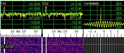
To activate this correlation display, select 'View / Windows' .. 'Correlogram' from the main menu. A correlation test (like the one described above) is contained in the SL configurations folder, "CorrTest1.usr". If the spectrum analyser is only connected to one input channel, the correlogram (and the correlation graph) will show the autocorrelation (correlation of the input signal with itself).
The displayed lag range can be modified by pulling the scale with the mouse (the same way as with the frequency scale in the other display modes).
The output of the correlator is *not* normalized to the average input amplitude. Instead, the following scaling and sign convention was chosen (quite arbitrarily):
- A sine wave, with the maximum possible amplitude (just below the clipping point) fed into both analyser inputs, will produce 100 % output at the time lag where both signals coincide.
- If the signal at channel #1 leads the signal at channel #2, the maximum correlation will be at some positive lag (don't ask why..)
- If the signal at channel #2 leads the signal at channel #1 (aka Ch1 lags Ch2), the maximum correlation will be at some negative lag
Due to the FFT windowing, the coefficients at the edges of the window (extreme
lags) may be attenuated. This may be compensated in a future version of SL,
if required for some application (it can be avoided by using a rectangular
FFT window ). In January 2009,
the correlator / correlogram was so rarely used that putting
more effort in it didn't seem justified.
Displaying Icom's broadband spectrum instead of SL's FFT output
As of 2018, most of Icom's 'direct sampling' allmode transceivers (and a few receivers) with built-in waterfall display support reading the Spectrum via USB, LAN [IC-9700], or WLAN [IC-705] through an extended set of CI-V commands.Spectrum Lab can be configured to read Icom's spectrum data through its 'Tranceiver Interface' / 'Radio Control Port'.
It can even bring the spectrum (along with the audio) 'online', into modern web browsers, using techniques (and Javascript) borrowed from OpenWebRX.
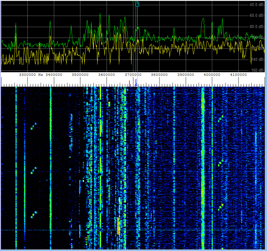
Remotely displayed broadband spectrum (1 MHz wide) read from an IC-7300 via CI-V.
Other suitable radios are IC-9700, IC-705, IC-905, IC-7610, IC-7851, and receivers like IC-R8600.
To use this feature, first check if you can establish a "remote" connection to the radio (via USB / virtual COM port) as explained under Transceiver Interface / CAT control / CI-V.
For radios with a LAN interface (IC-9700) or WLAN (IC-705), proceed as described here.
Next (as for most other 'special' display options in Spectrum Lab), from the main menu, select
Options .. Spectrum display settings, part 2.
In the group box Special display options, check
show REMOTE spectrum (via CI-V) .
When using the 'remote spectrum' display, you should also ...
- check option 'Include VFO offset on frequency' on SL's "Freq"-panel,
- check option 'Synchronize VFO frequency with remotely controlled rig' (same panel),
- in your Icom radio, set 'CI-V Transceive' to 'ON',
so the radio reports its VFO frequency when turning the dial.
See also: CAT traffic monitor (helps troubleshooting CAT / CI-V communication),
Transceiver Interface Settings, CAT control (here: CI-V)
(reading Icom's "waveform data" requires 115200 bits/second on the 'Radio Control Port').
About the IC-7300's disappointing "digital IF output" (which is not an I/Q output)
Frequency Scale
The visible frequency scale is located between spectrum graph and waterfall (if both are visible). It is usually horizontal ("X-axis") and in most cases (*) shows only a part of the processed audio spectrum (which is defined by the FFT settings). You can add or subtract a user-defined offset if you want. You can also split the scale to zoom into two independent ranges. The frequency scale may look like this:
![]()
The colored rhombic symbols on the frequency scale are
markers (they may be simple
indicators but also versatile control elements). The markers
can be controlled via interpreter commands in the
frequency marker table, which you
can activate by double-clicking on a marker. You can move a marker by holding
the left mouse button pressed. For example, a frequency marker can be connected
to a signal generator's frequency, to the local oscillator of the audio
frequency converter, to the AFC center frequency of the digimode decoder, etc.
Optionally, the main frequency scale can also show the three most important
parameters (frequency shift as 'zero beat' marker, lower, and upper edge frequency)
of the FFT-based audio filter.
Example:
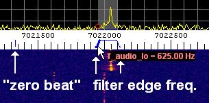
(screenshot of main frequency scale with filter passband display / controls)
Radio Station Frequency List
To show certain 'frequencies of interest' without using one of the programmable markers, a 'Radio Station' Frequency List can be loaded into Spectrum Lab. Frequencies of radio stations appear as thin coloured lines in the main frequency scale and in the spectrum graph.
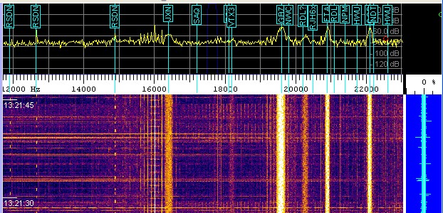
(VLF spectrum/spectrogram with 'Radio Station' display)
- (*) 'In most cases', the frequency scale can only show the range covered by the input signal.
- So far, the only exception is the 'broadband spectrum' that certain Icom radios
(like the IC-7300, IC-7610, and similar direct-sampling DSP rigs) can deliver
with a new CI-V command (0x27). Spectrum Lab can parse it since V 2.94 .
Popup menu of the main frequency scale
Clicking into the frequency scale (on a particular 'frequency of interest', not on one of the frequency markers) with the right mouse button, opens the frequency scale's popup menu:
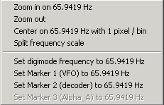
The menu contains some frequently used functions. Most of the entries should speak for themselves, some are explained in the next chapters.
Adjusting the visible part of the frequency scale
The displayed frequency range can be modified by pulling the visible frequency scale with the mouse (left button pressed). Or right-click into the interesting part of the frequency scale and select "Zoom In" or "Zoom Out" in the popup menu.
Alternatively you can enter the "edge frequencies" (Min + Max) in the frequency control panel on the left side of the main window:
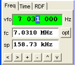
(frequency scale
control panel)
More information about the frequency control panel is here.
Splitting the frequency scale into two ranges
Can be activated from the display settings dialog or from a popup menu which opens when you click the frequency scale with the right mouse button. Use it, for example, if you want to have an "audio band overwiew" on the left side of the screen and a zoomed display of a certain frequency range on the right side. The separator between both scale sections can be moved with the mouse (not necessarily in the center of the screen !).
- Note:
- If the option "split frequency scale" is set, but only one input channel active for the spectrum analyser, both sections show different frequency ranges of the same signal. If two input channels are active for the spectrum analyser (showing different signals on one screen), the frequency scale will be split into two sections automatically.
To modify the frequency range of a frequency scale section, first click into the section on the visible frequency scale. The frequency scale control panel will then show "Freq1" or "Freq2" instead of "Freq", and the edit fields will apply to one section only.
Adding or subtracting a user-defineable frequency offset (for the display)
On the frequency control panel, you can enter a frequency offset which will be added to the displayed frequency. This does not affect the internal processing, it is just for the "optics".
If you want to SUBTRACT the displayed frequency from a certain value (for example because you have an LSB receiver tuned to 138kHz), enter the value "-138k" in this field. After three seconds, the entered value will become effective (the entered value will be normalized), and the frequency scale will be updated with the new settings. (Note: for LSB receivers, you should additionally activate the "LSB mirror" in the settings menu).
Multiple channels for the spectrum display
No matter if SL is configured for one, two, or up to four inputs
from the soundcard, the main frequency analyser can be switched
to "multi-channel" mode.
All (up to four) channels can be tapped at different points in the
test circuit, for example channel
#1 can be connected to the left audio input, and channel #2 to the right
audio input. Or, channel #1 may be connected to the "input signal" (before
the DSP chain) and #2 to the "output signal" (which goes to the D/A converter).
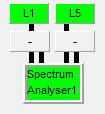
Spectrum Analyser 'input selectors' in the circuit window.
Upper row: Ch1 is connected to circuit node 'L1', Ch2 to 'L5'.
Lower row: Ch3 and Ch4 are not connected, and thus 'off' in this example.
The channel selection can be modified in the
circuit/component window, which can be opened
from the "View/Windows" menu.
If two input channels are active for the spectrum analyser (showing two
different signals on one screen), the frequency scale will be split into
two sections automatically.
The width (along the frequency axis) of each SA display channel
can be configured (as a percentage, not as a 'number of pixels')
as explained here.
Spectrum Averaging (Overview)
For some special "weak signal" applications, Spectrum Lab offers different ways and stages of averaging. Averaging can be superior to simply increasing the FFT size, if the observed signal is "broad" (incoherent; phase-, frequency- or amplitude modulated, etc).
There are various stages of (spectrum-) averaging, which will be explained in some depth later:
-
"Internal average" at the FFT-calculating stage: This is a simple averaging
of powers (or energies), directly after the FFT calculation, using a leaky
integrator.
This kind of averaging is always possible, even if the waterfall scrolls faster than the time required to collect new data (in the time domain) for a single FFT. It is configured on the "FFT" panel in the "internal average" field. This kind of averaging can help to see weak signals in the waterfall display, at the expense of "smearing" along the time axis.
-
"Waterfall line average": If the waterfall scroll interval is longer than
the time to aquire data for a "new" FFT, a larger number of FFTs will be
calculated and added, before a new line is added to the waterfall display
(and shown in the spectrum graph). This kind of averaging is active when
the scroll interval (t_scroll) matches the following criterion, and the option
"optimum waterfall average" is selected in the Display Settings:
t_scroll > (FFT_size / sampling rate) .
The number of FFTs added this way (into a single "spectrum", which will then be displayed in the graph and/or waterfall) depends on the waterfall scrolling speed, the audio sampling rate, and the FFT size. The interpreter functionwater.avrg_maxreturns the number of FFTs added in each line of the waterfall (you can use this function to calculate the "gain" from this incoherent averaging, as explained somewhere below).
Unlike the first average option ("internal average"), this kind of averaging does not cause a "smeared" display, for the expense of a slowly scrolling waterfall.
-
"Triggered average": This special
kind of averaging only works when the waterfall screen runs in "triggered,
non-scrolling" mode. It can only be used for periodic signals, for example
in the "low power moon radar" experiment, where a large number of VHF pulses
were sent to the moon, and the reflections collected over a long time before
they became visible on the spectrogram (which was synchronized with the
transmit/receive interval).
To configure this kind of averaging, open the 3rd(?) tab of the Spectrum Display options (with the panel "Options for Triggered Spectrogram"). Set the checkmark for "triggered spectrum", and set the trigger control to "one SWEEP of the spectrogram" (=one waterfall screen).
Details about this special kind of averaging can be found in the "Alpha" VLF beacon example .
To test the triggered average spectrogram without an off-air signal, load the configuration 'TrigSpectTest1.usr', which is contained in the installer (subdirectory 'configurations'). Let it run for a few minutes until details in the spectrogram crawl out of the noise (generated by SL's test signal generator).
To clear the 'triggered' spectrogram average buffers, use command spa.clear_triggered_avrg, or use the 'Reset' button for the triggered average spectrogram on the already mentioned panel "Options for Triggered Spectrogram".
-
"Long term average (spectrum)" :
This option was added for the Earth-Venus-Earth
experiment at the IUZ Bochum in 2007. The long-term average is basically
a second stage of averaging (after the "FFT internal average" and the "Waterfall
line average". Later (in 2011), an optional exponential decay was added for
the long-term average. The long-term average can be enabled on the first
part of the Spectrum Display
Settings. The long-term average spectrum display works as follows:
All spectra (FFTs) which are displayed on the waterfall are added to the so-called long-term average (with some optional preprocessing, as described in the document about the Earth-Venus-Earth experiment).
The long-term average spectrum is displayed only as an additional curve in the Spectrum Graph window (not in the waterfall !). This is typically a red curve, but the colour may be modified through menu 'Options'..'Spectrum Display Settings' (part 3). When active, the long-term average is painted with the fifth pen ("Pen 5", which is RED by default), as defined on the 'Display Colours' panel.
The total number of FFTs added in the long-term spectrum average can be calculated with this formula (to show it on one of the programmable buttons, as used in the Earth-Venus-Earth configuration):
spa.lta_cnt*water.avrg_max + water.avrg_cnt ,
where :
spa.lta_cnt = total number of waterfall lines(!) added in the long-term average spectrum,
water.avrg_max = number of FFTs added in each line of the waterfall ("waterfall line average"),
water.avrg_cnt = number of FFT added in the current (still invisible) waterfall line .
The long-term average can be cleared through the popup menu of the spectrum graph: Right-click into the graph, then (in the popup menu) select "Spectrum Graph Options" ... "Clear long-term average". In the same popup menu, the curves for the long-term average and the "momentary" spectrum can be turned on and off.
Alternatively, the long-term average can be cleared with the command "spa.clear_avrg". In the EVE-configurations, one of the programmable buttons is used for this purpose.
Since 2008-03, the long-term-average spectrum can also be exported as a textfile, controlled by the interpreter .
Since 2011-11, an optional 'exponential decay' can be configured for the long-term average. The decay rate is specified as the half-life interval (auf Deutsch: Halbwertszeit), measured in minutes, on the first panel of the Spectrum Display settings, close to the checkmark which enables the long-term average spectrum in the main spectrum display. Note that the 'counter' of spectra added into the long-term average buffer is also affected by the exponential decay, thus even the 'counter' value (spa.lta_cnt) may be a fractional (non-integer) value, which is unusual for a "counter" - but that's the way it is. If the half-life interval is nonzero, the 'counter' will asymptotically approach an upper boundary value, which depends on the waterfall scroll rate (i.e. the interval at which new FFTs are calculated), and the half-life time.
- "FFT Smoothing" : Doesn't calculate an average from consecutive FFTs, but on neighbouring frequency bins within a single FFT. Together with the other averaging options mentioned above, this may help to reduce the 'visible' noise in the spectrum display if you are looking for very weak signals. Details about FFT(-bin)-smoothing are here .
The "Second Spectrogram"
This is a simple "second" spectrum analyser, not as versatile as the display in the main window. It can be used to show another portion of the spectrum, or analyze another audio source if you have a stereo soundcard (or 2-channel ADC).
To open a window the second spectrogram, enter the "View/Windows" menu of the main window, then select "Second Spectrogram". To activate the spectrum analyser for the second window, and select the source, use the "Mode" menu of the second spectrogram window.
Notes:
- You can also activate the second spectrogram from SpecLab's circuit/component window, where you can also see where the input for this analyser comes from. Click on the small "source" label to open a list of all available sources.
- Some interpreter functions like "peak_a" and "peak_f" can operate on the spectrum from the second spectrum analyser also.
Last modified : 2021-05-15
Benötigen Sie eine deutsche Übersetzung ? Vielleicht hilft dieser Übersetzer (Google Translate) !
Avez-vous besoin d'une traduction en français ? Peut-être que ce traducteur vous aidera !