
The watch window can be used to show some values on the screen. The displayed values are periodically updated (calculated), and the result displayed in numeric or graphic form. You can display (but not modify) almost anyything in the watch window which can be accessed with the built-in interpreter.
This document describes
See also: Spectrum Lab's main index ,
numeric expressions,
interpreter functions ,
phase-and amplitude meters
, file export function .
(remember to use the browser's "back" button to return here..)
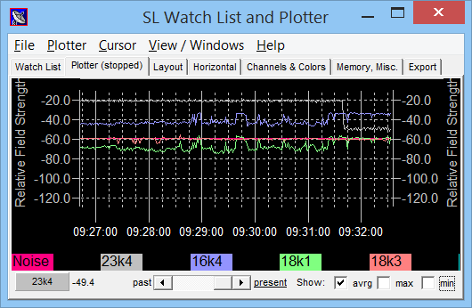
The "watch list" is a table with numeric expressions (formulae) which you can watch in real time. Some of the columns in this table must be filled out by you (the user), others (like the "Result" column) are filled by the program. The watch list looks like this :
The columns in the watch table are:
wv ("watch value").You can modify the column widths of the watch table with the mouse. Place the cursor in the grey table headline and move the column separator left or right with the left mouse button pressed.
Frequently used expressions for the watch list:
peak_a(freq1, freq2)
returns the amplitude (maybe dB's) of the strongest signal in the specified
frequency range. Example to retrieve the spectrum peak amplitude
of a radio signal between 23.3 and 23.5 kHz:
peak_a( rf:23300, 23500 )
peak_f(freq1, freq2)
returns the frequency (in Hz) of the strongest signal in the specified
frequency range. Example to retrieve the frequency of the strongest peak
of a radio signal between 23.3 and 23.5 kHz:
peak_f( rf:23300, 23500 )
noise_n(freq1, frequ2)
returns the noise level in the specified frequency range, normalized to a
1-Hz-RX bandwidth
azim(freq1, freq2)
returns the angle-of-arrival ('bearing') of the strongest signal in the specified
frequency range. Only works in radio-direction-finder mode.
pam1() . amplitude, . phase,
. frequency (etc)
Details in the documentation of the phase- and amplitude monitor functions
.
See also: Overview of numeric functions in the documentation of the command interpreter.
The plotter can be used to display the latest results of the watch list as slowly scrolling Y(t) diagram. The scrolling speed and other display options can be set on different tabs of this window.
Notes:

Plot window with and without option 'hide menu and title'
The plotter settings are divided on a number of tab sheets:

Here you can define the plotter's Layout, Horizontal Axis + Timebase, Vertical Axis, Channels, Colors, Legend, and other options ...
On this tab sheet you define..
defines how the grid for the vertical scale shall be drawn, like "dotted lines", "thin lines", "bold lines" or "no lines at all".
defines some properties of the font used to draw numbers and labels for the vertical scales. Click on the 'font' panel to open a dialog where you can select one of the windows fonts and define the font size. The other "font" selection panels work the same way; they are not mentioned in this document.
declares if a vertical axis shall appear on the left side of the plotter
diagram, and to which channel the scale shall be assigned. The vertical axis
uses the scale range defined in a channel's "min"
and "max" value definition in the watch list (!). The scaling and range
of the LEFT vertical axis also define the position of the vertical grid (in
contrast to the RIGHT vertical axis).
The width for the numbers on a
vertical axis is detected
automatically by trying to format the "min" and "max" values into a string,
using the "format"-string from the watch definition
table.
enter a text string which shall appear close to the left vertical axis, like "dBuV/m" like in the sample diagram.
same as the Left Vertical Axis but this axis appears (if required) on the right side of the diagram... but: the right vertical axis does not affect the vertical grid overlay of the graph area.
defines if -and where- the legend shall be drawn; how much details shall be in the legend and the font to be used.
On this tab sheet you define..
the interval between two one-pixel-scrolls of the graph area (if the horizontal magnification is set to 100 percent).
Can -one fine day- be used to zoom into a part of the diagram. Usually, this value must be 100 % (and, by the time of this writing, it did not have any function at all).
There are two types of time markers, which can have different styles. The most important difference is, that 'large' markers will be labelled with a date and/or time expression as defined under "Time Format".
Is the time (in seconds) between two markers. Be careful: Too large values, and you hardly see any marker, too low values, and the screen will get crowded with markers. A good choice is to set the small marker interval to 15*60 (which means small marker every quarter of an hour) and large markers to 60*60 (which means every full hour). You can let the program do the multiplication for you.
Defines how a marker shall be drawn. You have the choice between thin lines, dotted lines, bold lines, or small, medium or large "ticks". A tick is a short line at the bottom of the diagram, while a "line" in this context is a vertical line across the whole graph area. You should use a 'decent' style for small markers and full lines for large markers. In the sample diagram, dotted lines were used for small markers and thin lines for large markers.
Use hh:mm if you need the hour and minute information only, or YYYY-MM-DD
if you want to see the date displayed (there is a large variety of valid
format strings, more info can be found in the description of the built-in
interpreter).
You can use a different format string at the beginning of a new day, like
in the sample diagram.
On this tab sheet you define..
the color of grid lines,
the background color,
the color for text labels inside the graph plotting area (like time labels etc),
the color for all plotter pens
To change a color, click on one of the colored panels and the well-known color selection dialog opens.
Channel settings:
First select the channel number, to see all display properties for a particular channel. This includes:
Defines, HOW the three following values of a channel shall be displayed :
- "off" means the channel is not displayed at all.
- "single dots" means that min,max,average are all displayed as single dots
(not joined by lines).
- "mixed" means that min and max are displayed as single dots, but the average
value is drawn as a joined line (author's choice..)
- "all lines" means that min,max,average are all displayed as joined lines.
Not too good for "noisy" data on a small screen.
If this checkmark is enabled, the minimum value of this channel during an aquisition period (or "scroll interval") is visible.
If this checkmark is enabled, the maximum value of this channel during an aquisition period (or "scroll interval") is visible.
If this checkmark is enabled, the average value of this channel during an aquisition period (or "scroll interval") is visible.
Note: Under certain conditions, there is no difference between "Min", "Max", and "Average" value; especially when the scroll rate of the diagram is quite high.
On this tab sheet you define..
Memory, Misc: defines the dimensions of a file which saves the latest plot data. Enter the number of samples and the number of channels you need. If you use the temporary plot files for an "archive", make the number of samples high enough. The program uses a memory-mapped file as a buffer, so you don't loose data if you exit and restart the program.
Also on this tab are some "special" options, mainly used for testing :
Private
Don't care about this. I used it for debugging.
This box is used to define some properties of an ASCII data file. Such files can be used to exchange data between Spectrum Lab and other programs, mainly for post-processing. Some controls in this box are:
defines the name of a text file to import or export data.
Note: You can also change the name of the export file through an interpreter
command.
The decimal code of a special character in the files used to separate the columns. Possible column separators are comma, semicolon, space, or tab character. The charater sequence to separate two lines in an ASCII file is carriage return + new line as usual (this cannot be changed, not even for Linux users).
Usually on column in the import/export file holds the TIME of a sample point. If you know that the time in your ASCII files is in the first column, enter "1" in this field. Otherwise the program looks into the first line of the file (which is the "title" line) and looks for the strings "Date", "Time" etc to detect the column number itself. If the time column is not automatically recognized when you try to import data from an ASCII file, you must define this field.
Because there are a dozen different ways to write a time+date, you must enter
a format string here with a couple of placeholders for all letters in the
"time" column of the imported or exported ASCII file. Examples:
YYMMDD hh:mm:ss is a good and 'very logical' format for a machine (most
significant value first),
DD/MM/YY hh:mm:ss is prefered by humans.
The following interpreter functions and procedures can be called from Spectrum Lab's command window, or as a periodic or scheduled action:
Saves the current diagrams as an image (like a screen capture).
Examples:
plot.capture("p"+str("YMMDDhh",now)+".jpg")
Saves the diagram as a JPEG image, a date-and-time dependent file name will
be automatically generated.
plot.capture("plotted.jpg",70)
Saves the diagram as a JPEG image with a quality of 70 (percent) which is
usually ok for the plot screen, so even small letters are readaby. If you
use quite large fonts for axis and legend, the quality may be reduced to
50 percent to save disk space. If the quality value is not specified in the
argument list, the value from the screen capture
options dialog is used.
Note: The plotter only works if its window is visible. For this reason,
"plot.capture" fails if the plotter window is not open !
plot.window.left, ..top, ..width, ..height
Retrieve or modify the position and size of the watch/plot window (measured in pixels).
plot.export("filename.txt")
Exports the entire plot data buffer as a textfile, in a "single over". This
is the same as the function "Export to Text File" in the watch window's FILE
menu. You don't need this function if the option 'periodically export the
plotted data' is already set in the "Export" tab, because in that case, the
data will be written to the file immediately (appended to the file, line
by line, as soon as the new data are available).
plot.export_file = "new_filename.txt"
Changes the name of the exported file on the fly. This only makes sense if
the option 'periodically export the plotted data' is set on the "Export"
tab, because otherwise you can specify the filename for the exported data
in the plot.export command.
Accesses one of the calculated values ("watch value") in the
watch table. XXXX must be the title of a watch definition.
For example, if you have defined a watch named "Noise" which measures the
noise level, then wv.Noise will always return that value (called
"result" in the watch list).
Can be used to show that value anywhere else (outside the watch table).
Note: In contrast to a normal interpreter variable, a title may also begin
with a digit. For example, 440k044 is a valid watch title, but not
a valid interpreter variable. An example for the wv-function can
be found here.
An overview of numeric interpreter functions which can be used in the "expression" column of the watch window (to define the contents of the plotter channels) can be found here.
