|
|
|
|
|
|
|
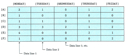
Figure 13-12
Absentee Data |
|
|
|
|
|
|
|
|
figures to the average also requires row processing, as does printing the table. We can calculate the percentage differences while we print the table. |
|
|
|
|
|
|
|
|
To compile the summary figures for the week, we must take the number of people absent on each day, divided by the total number of people absent during the entire week. A bar chart showing this information might look as follows, with each asterisk representing 10 percent: |
|
|
|
|
|
|
|
|
Monday Tuesday Wednesday Thursday Friday
100%
90%
80%
70%
60%
50%
40% *
30% *
20% * * *
10% * * * * * |
|
|
|
|
|
|
|
|
This chart has the following interpretation: 40 percent of the total absences were on Monday, 20 percent were on Tuesday, and so on. |
|
|
|
|
|
|
|
|
We can represent this chart as a two-dimensional array with ten rows and five columns. The rows represent the percentages to the nearest 10 percent. |
|
|
|
|
|