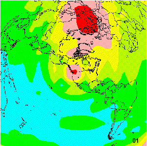
MUF over 24 hours
The Propagation Movie
![]()
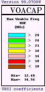
This page is an introduction to the 24 Hour forecast shown in the link at the left. On this page is also the key to the color code for the various frequency breaks in presenting the Maximum Usable Frequency.
To construct this movie, I made 24 separate forecasts for the Pacific Northwest for MUF. Each forecast was offset from the previous by 1 hour so as to obtain a 24 hour presentation. The software package, as shown by the scale here, is VOACAP which was produced for the Voice of America to aid in propagation modeling. This is a vary large application with considerable complexity. The graphics presented here are but a very small offering of the capabilities available. There are several Signal to Noise presentations as well as Path Loss, Transmit Launch Angle, Reliability, and so on. The program allows you to select from many antenna styles, or to specify your own (which is a bit tedious, but adequate).
The presentation I chose was MUF for this go round (I've presented DBU, or path loss, in the past). The chart shown on this page shows the frequency breakpoints that I chose to fall on the Ham bands above 40 meters. The color scheme is meant to represent rising frequency as correspondingly lighter colors in a red-blue-green progression. Sometimes browsers reinterpret these colors, so if your experience varies from this textual description, close examination and contextual evidence should put things right.
Sorry to have separated the key from the presentation, this would have increased the size of the movie beyond its already large 450KB. I would suggest that this movie be viewed with a good graphics viewer that offers you a control panel to adjust the frame rate, or to freeze a frame. The number in the lower right corner of each frame indicates the time in UT for that particular forecast. Under magnification, these graphics still present fairly good resolution.